My Design… Botany Posters Case Study
This project started with a simple thumbnail sketch for a single poster,
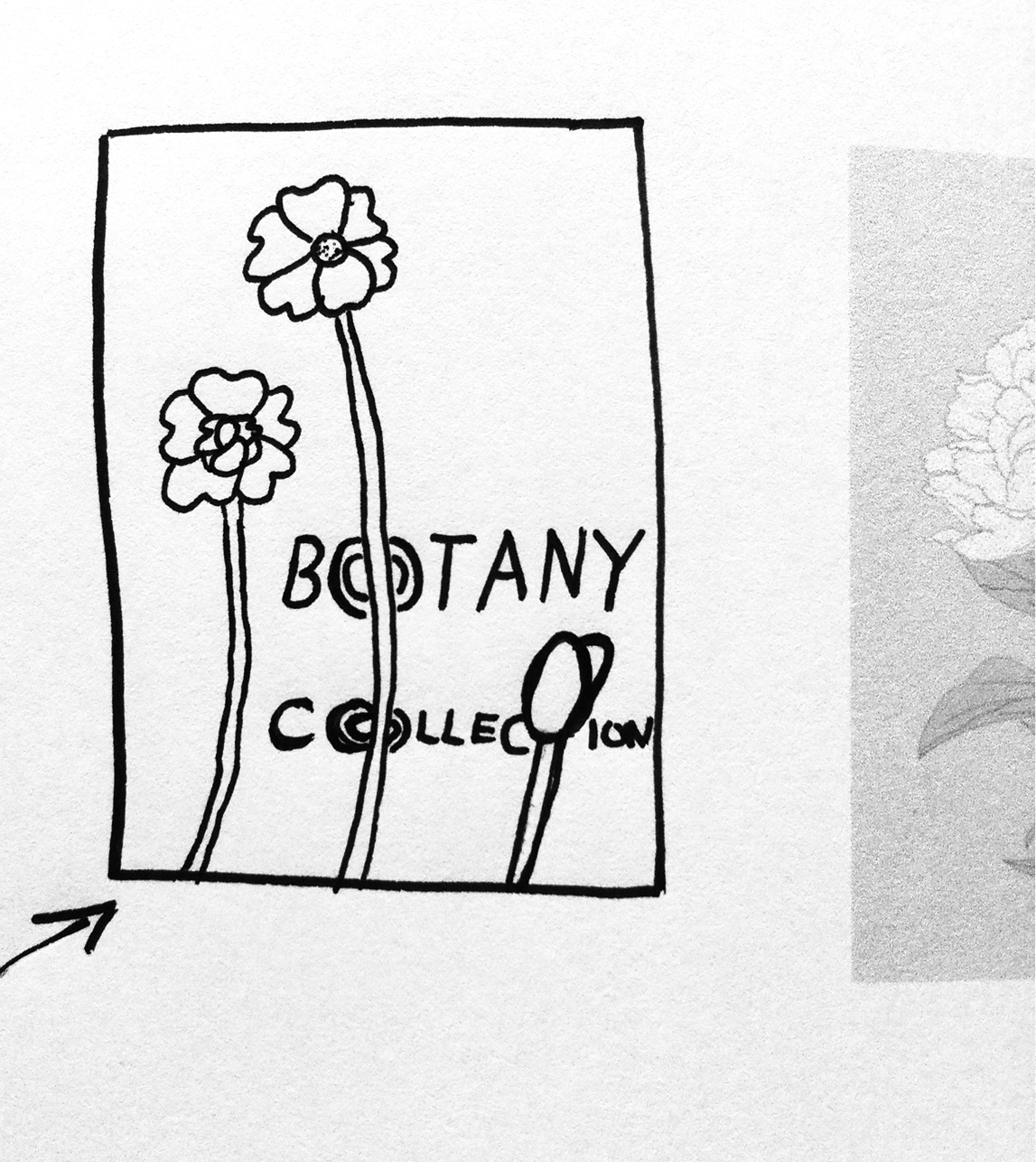
and was developed into two poster concept sketches with a bit more detail.

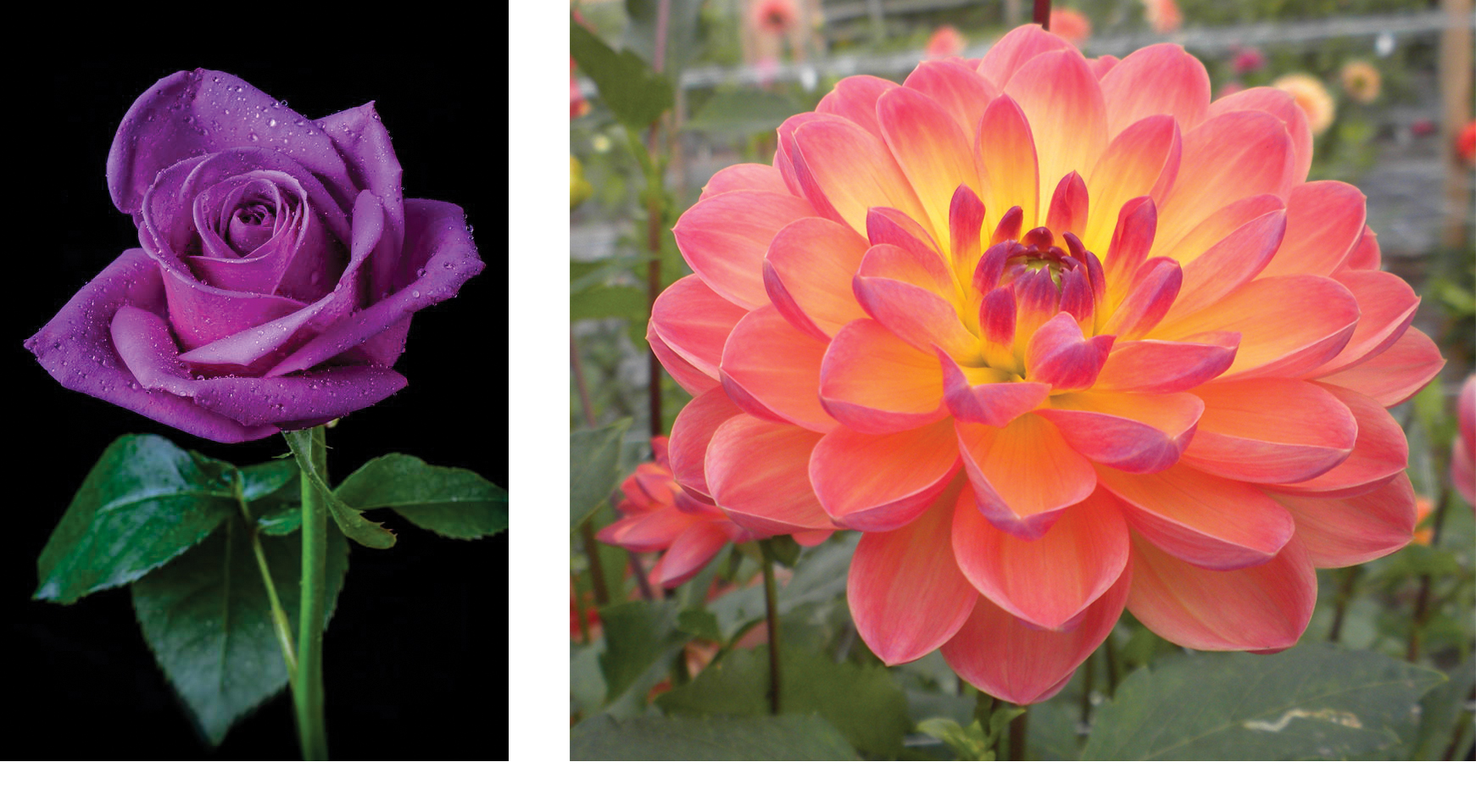
From there I sourced high quality images of flowers that I thought had strong but contrasting colours and would work well together on two posters. You can see that the second sketch changed into a flower based design because I thought it would like more consistant than one flower and one bonsai tree.
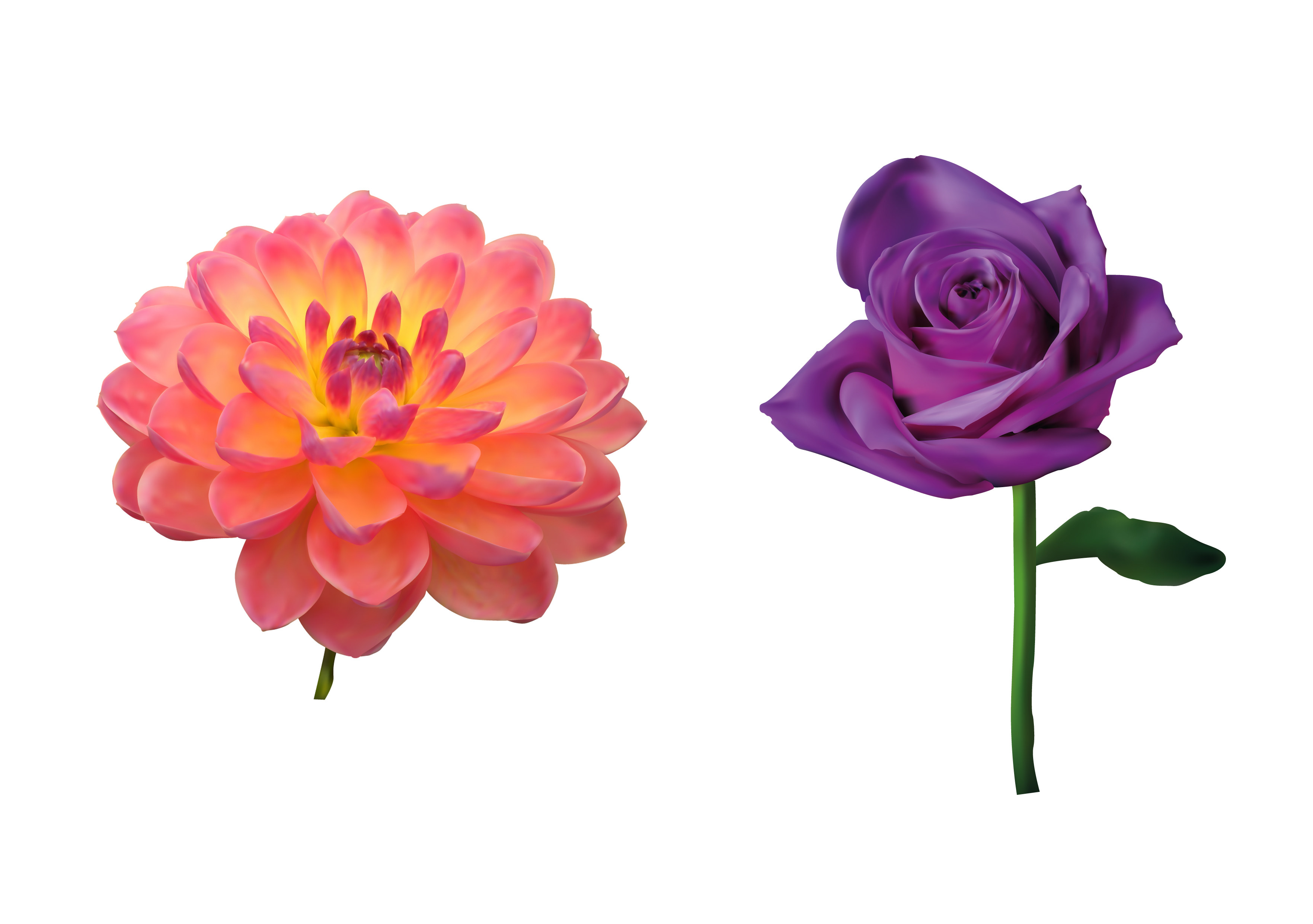
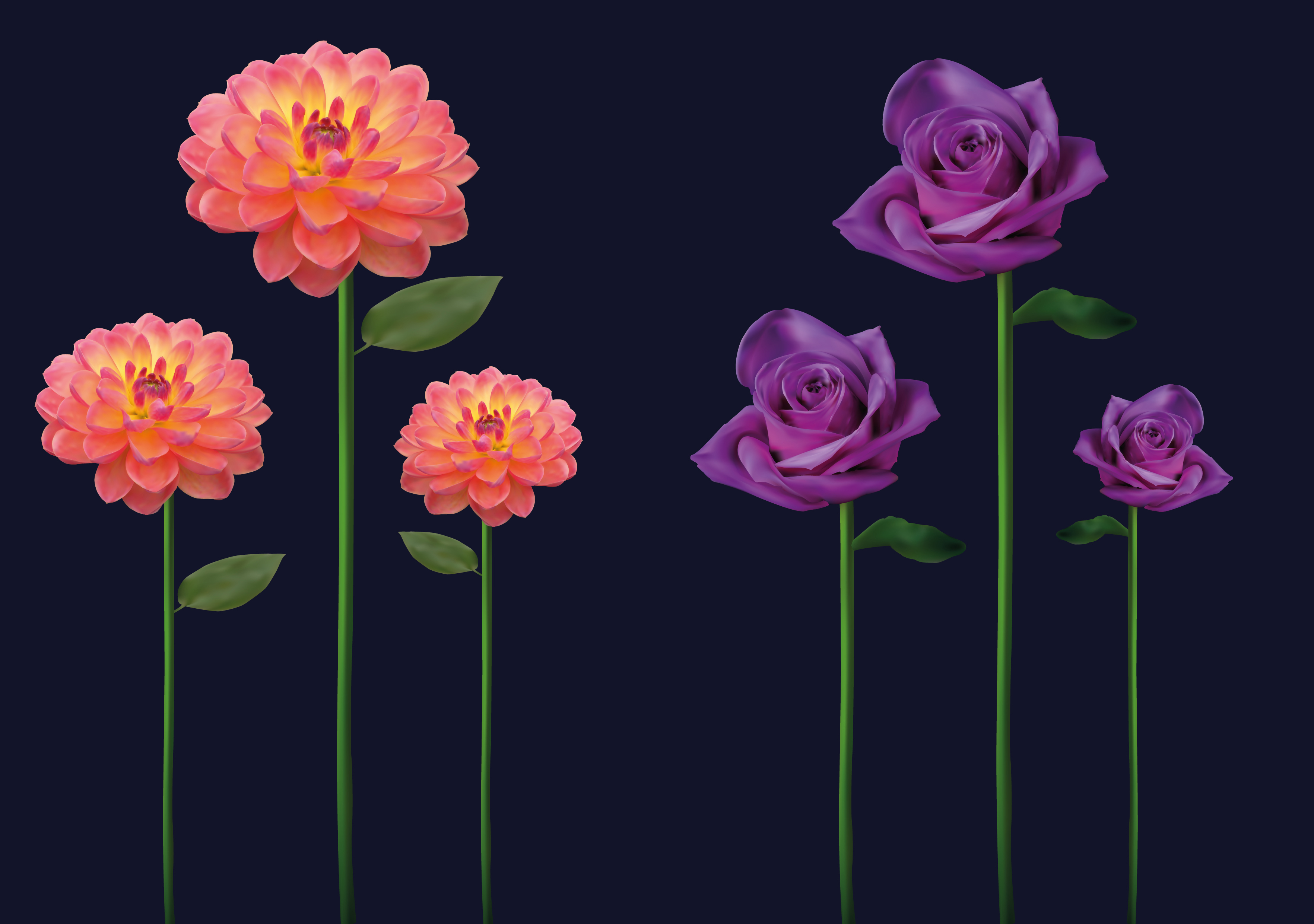
I took both of the images that I had chosen into Adobe Illustrator and made them into a template layer, which I set at 50% opacity. Then I drew around each individual petal with the pen tool, creating an outline of my flowers (which were less detailed than the image below).

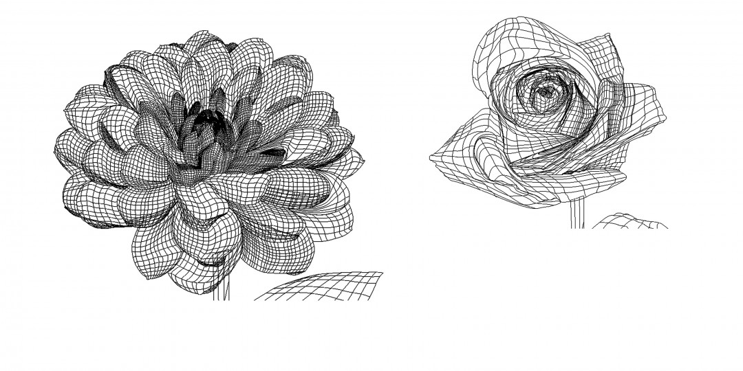
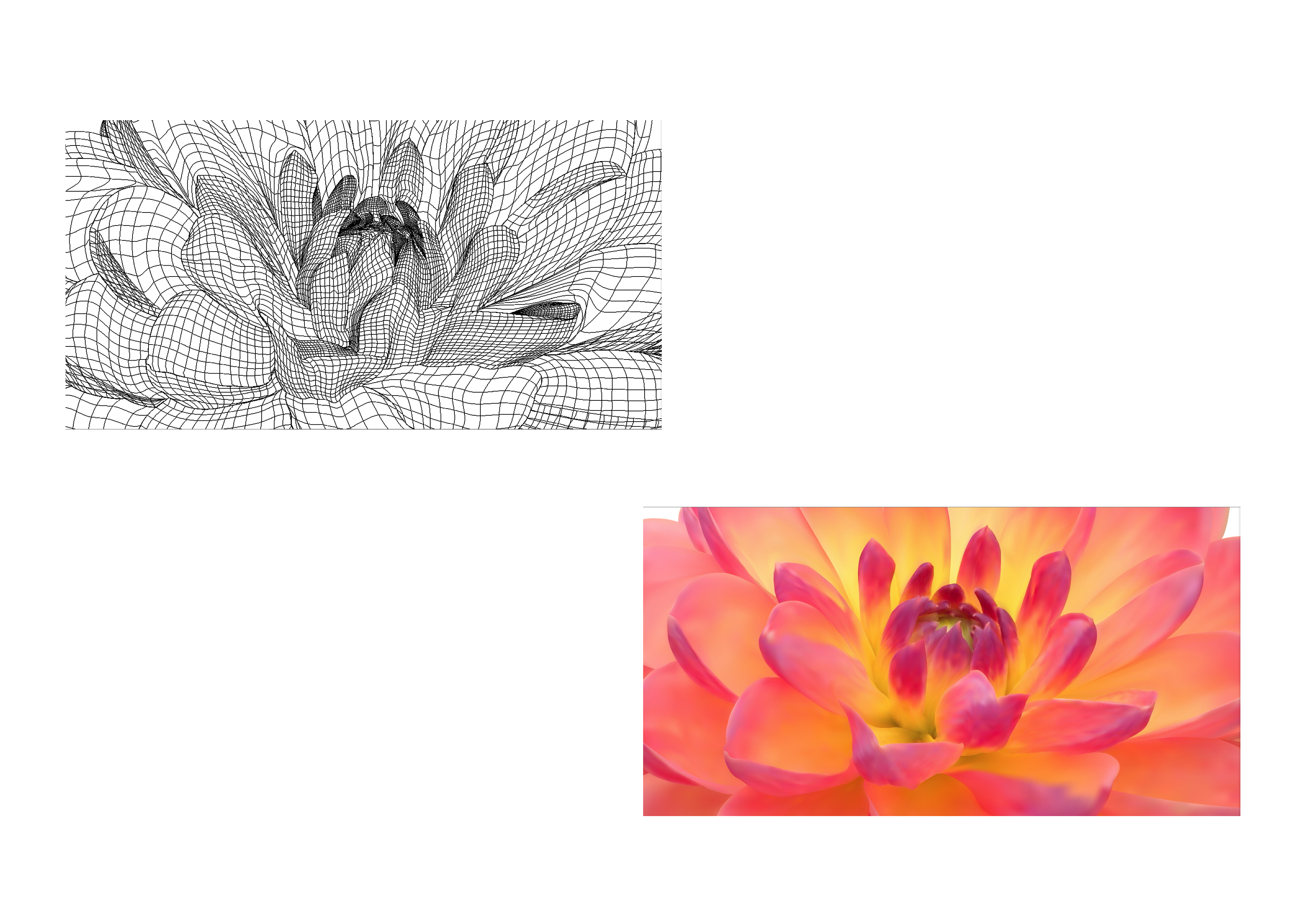
Then using the gradient mesh tool I turned each petal shape into a mesh of individual points, that you can see in the image above, and used the eyedropper tool to apply the colour from the template layer (the original photographs) to each point on the gradient mesh. I had to do this one point at a time for every point of the flowers and as you can see there were a few. This took many hours to complete for both of the flowers!
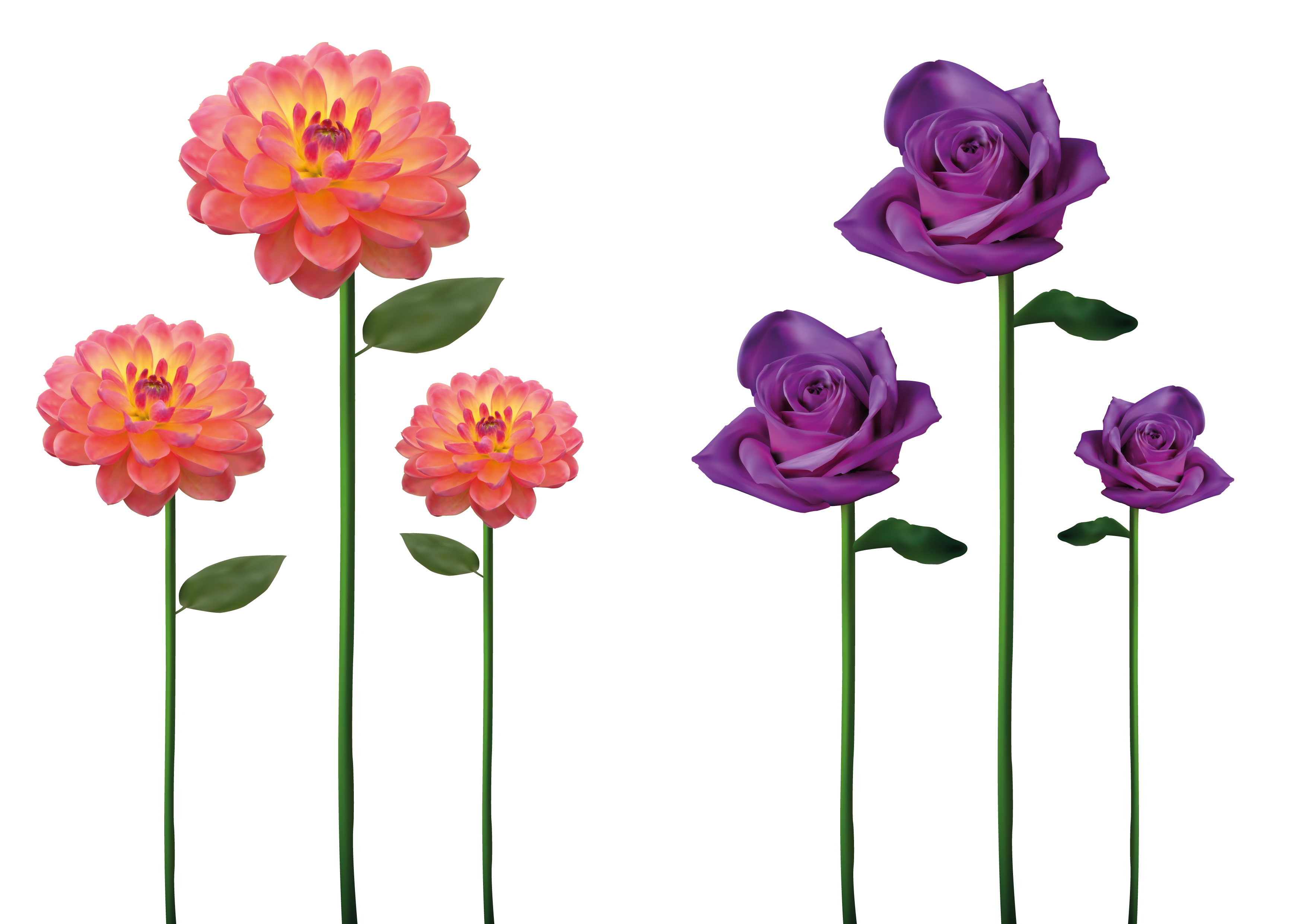
I then repeated this technique for every petal, a stalk and a leaf for both flowers. Both flowers were then taken onto a new A3 page and they were both duplicated and edited so that I had three flowers in a nice arrangment. The stalks were extended so that they went off the bottom of the pages.
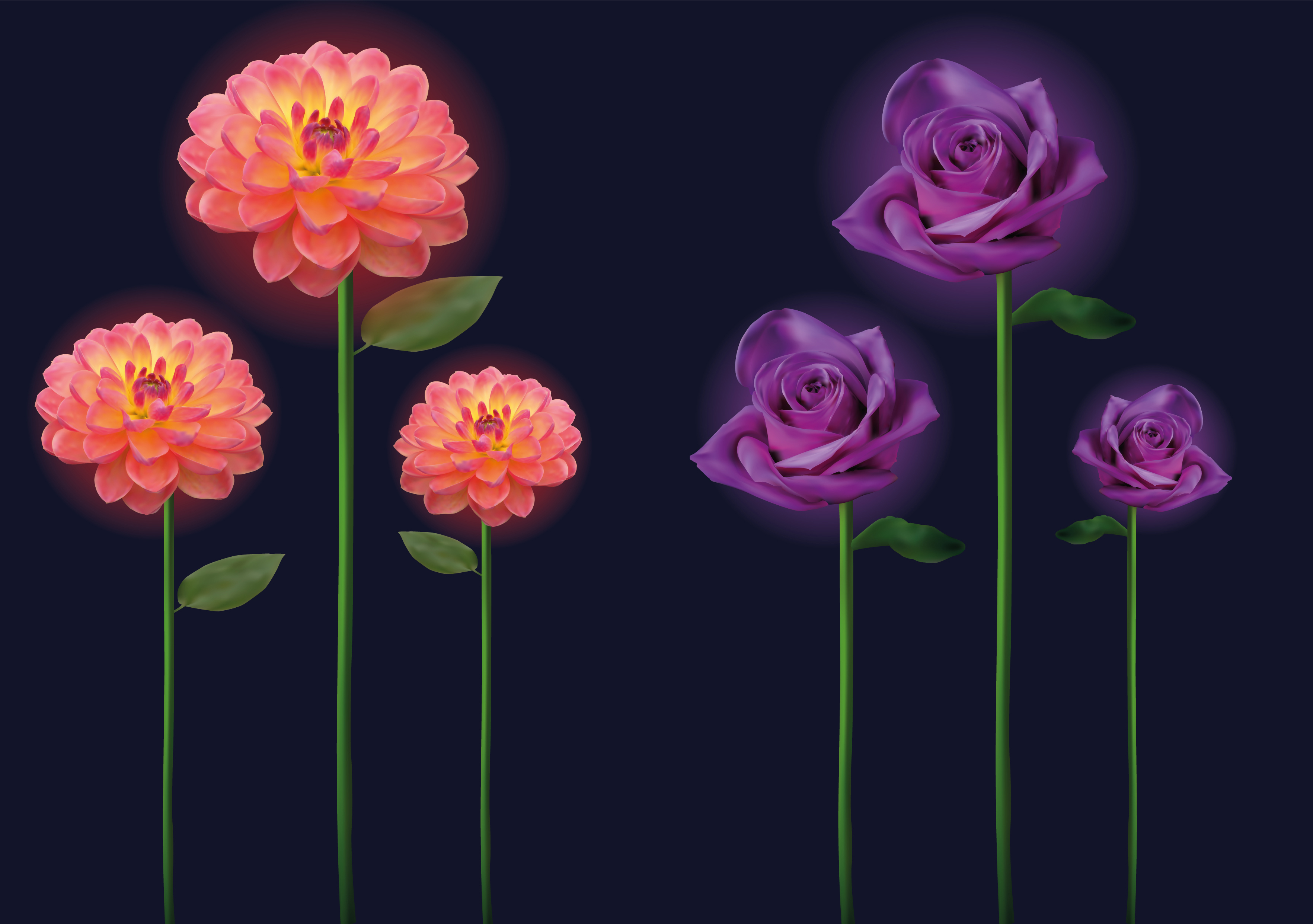
Then a dark purple/blue background colour was added to the posters along with a vector gradient to create a glow behind all the flowers. This creates a more engaging poster with the attention being drawn towards the flowers as the main features.
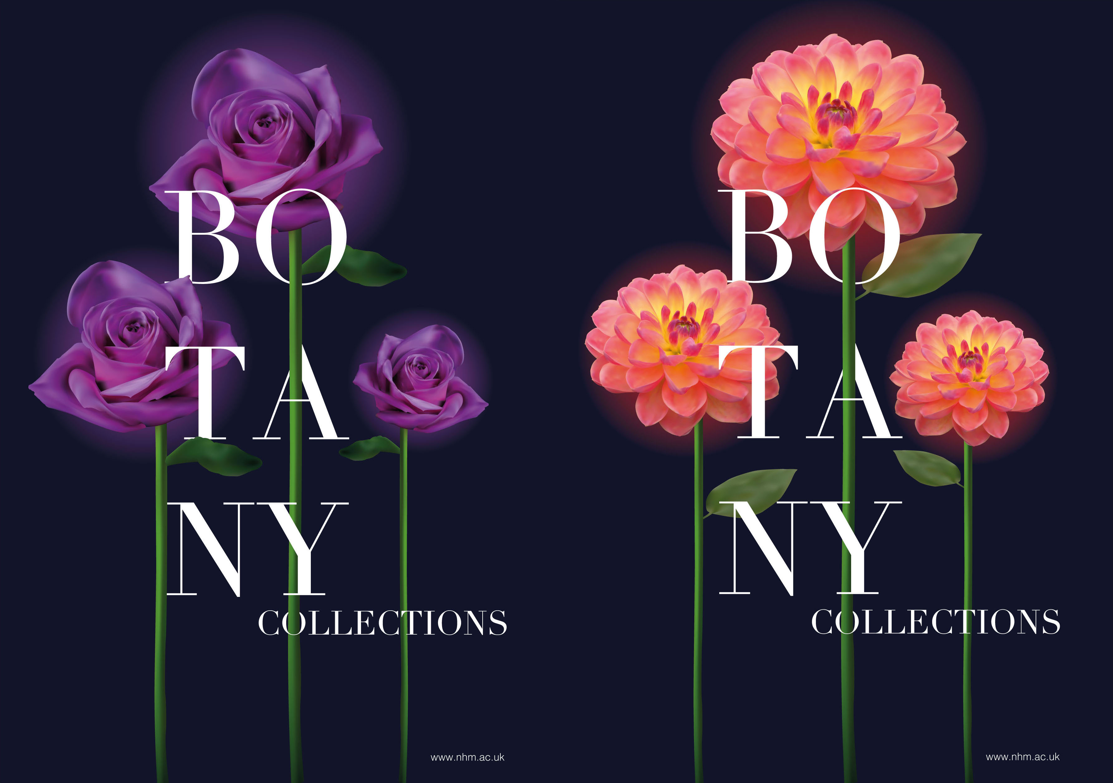
Finally I added the typography and used the Pathfinder – Divide tool to remove certain parts of the letters, and give the type the effect of being wrapped around the stalks. I also moved certain letters behind the flowers to further this effect. I chose to use the typeface Didot because of its classy and upmarket look which I thought worked well with the imagery and theme of Botany.
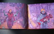
I really enjoyed working on this project. It gave me an opportunity to learn a new technique in Adobe Illustrator and I really enjoy how the two final posters looked. You can view images of the finished project here.