I Love… Ivan Belikov
Another artist whose work I really love and who inspires me is Ivan Belikov. Ivan is a Russian designer from Chelyabinsk, and is an awesome illustrator, who is skilled in digital and traditional mediums. He works mainly in Adobe Illustrator, using the brush tool, and focuses on nature motifs, with his illustration portfolio heavily featuring animals, both real and mythological.
Ivan’s illustration style is characterised by the high level of detail and depth that he puts into textures of his pieces. Because many of the subjects are animals He works with a deceptively simple tool kit, often only using a Wacom drawing tablet and Adobe Illustrator, to create artwork that is mindblowing in the way it pushes the medium of vector art to its limit.
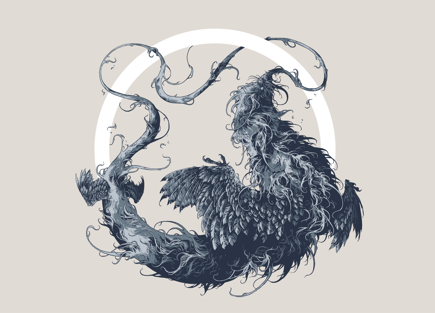
Below: Illustration of an ouroboros, the circular symbol of a snake (or dragon) eating its own tail.
Below: Monochrome illustration of a moth.

Below: Illustration of a manticore, the mythical creature with a lions body, bats wings and a scorpion tail.

Ivan’s work is very recognisable, not only by the subject matter of the illustrations, but the style of the artwork. The texture that he is able to create in his pieces is incredibly detailed and because he does so many animals he has become amazing at representing realistic fur and feathers. Even on other less conventional subject matter Ivan’s distinctive stroke style instantly sets his work apart from the rest and he puts great care and effort into making the subjects of his illustrations look as realistic as possible. This level of detail means that even the smallest sections of his illustrations are a joy to look at!
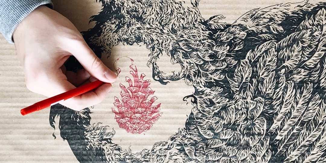
Below: Ink sketches of bird and pinecone.

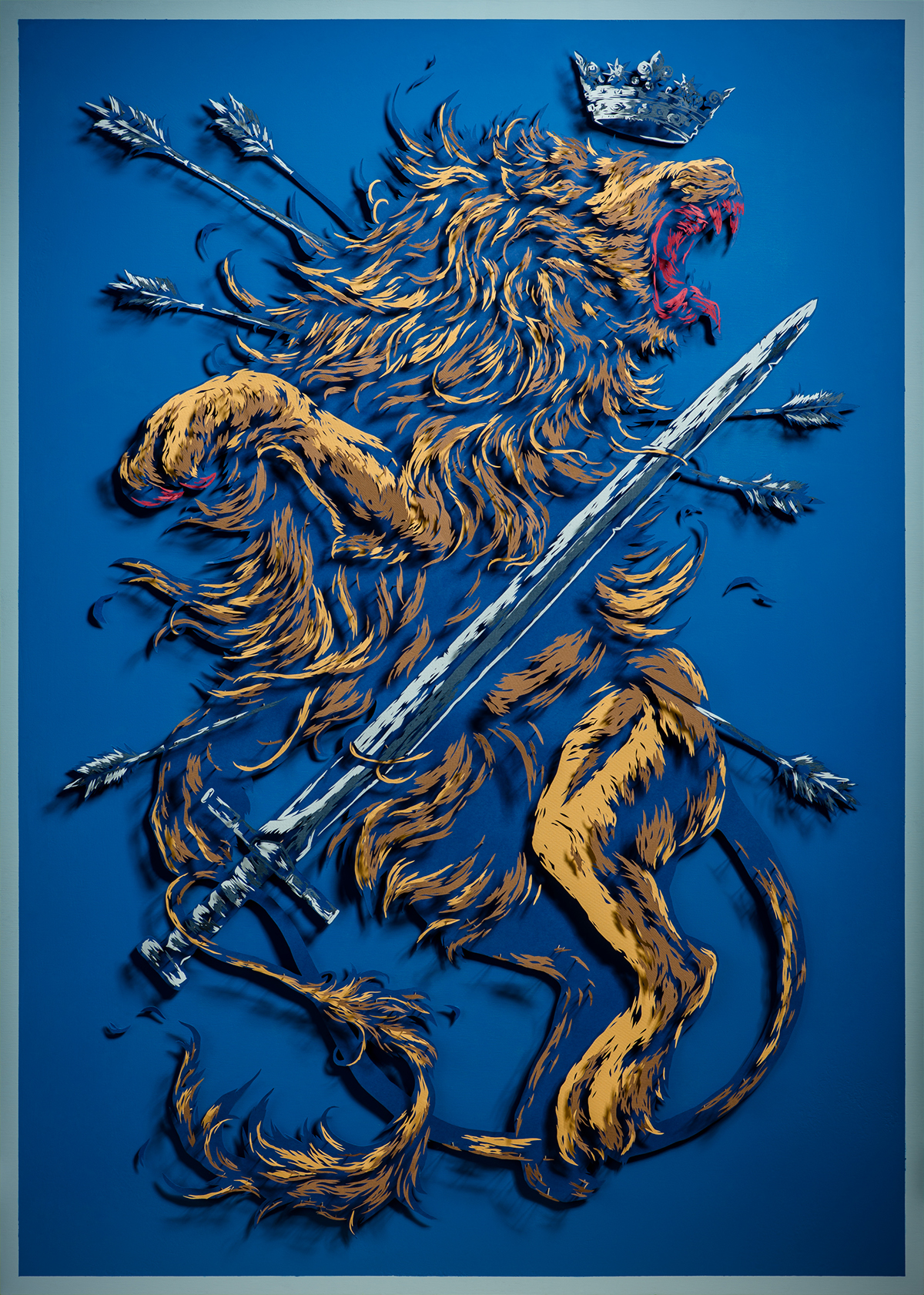
Below: Huge 3D illustration of the Netherlands coat of arms.
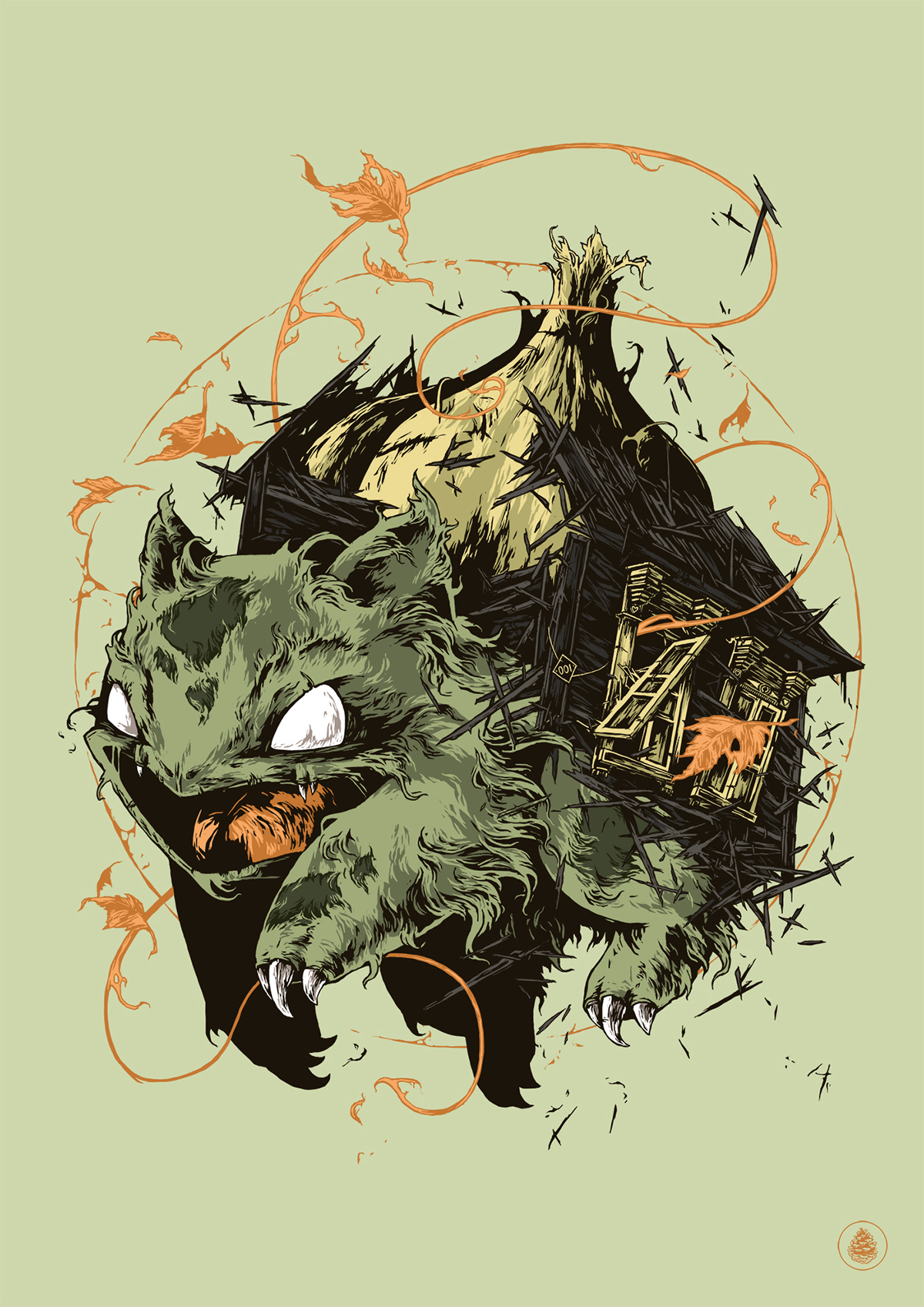
Below: Illustration of the pokemon bulbasaur.
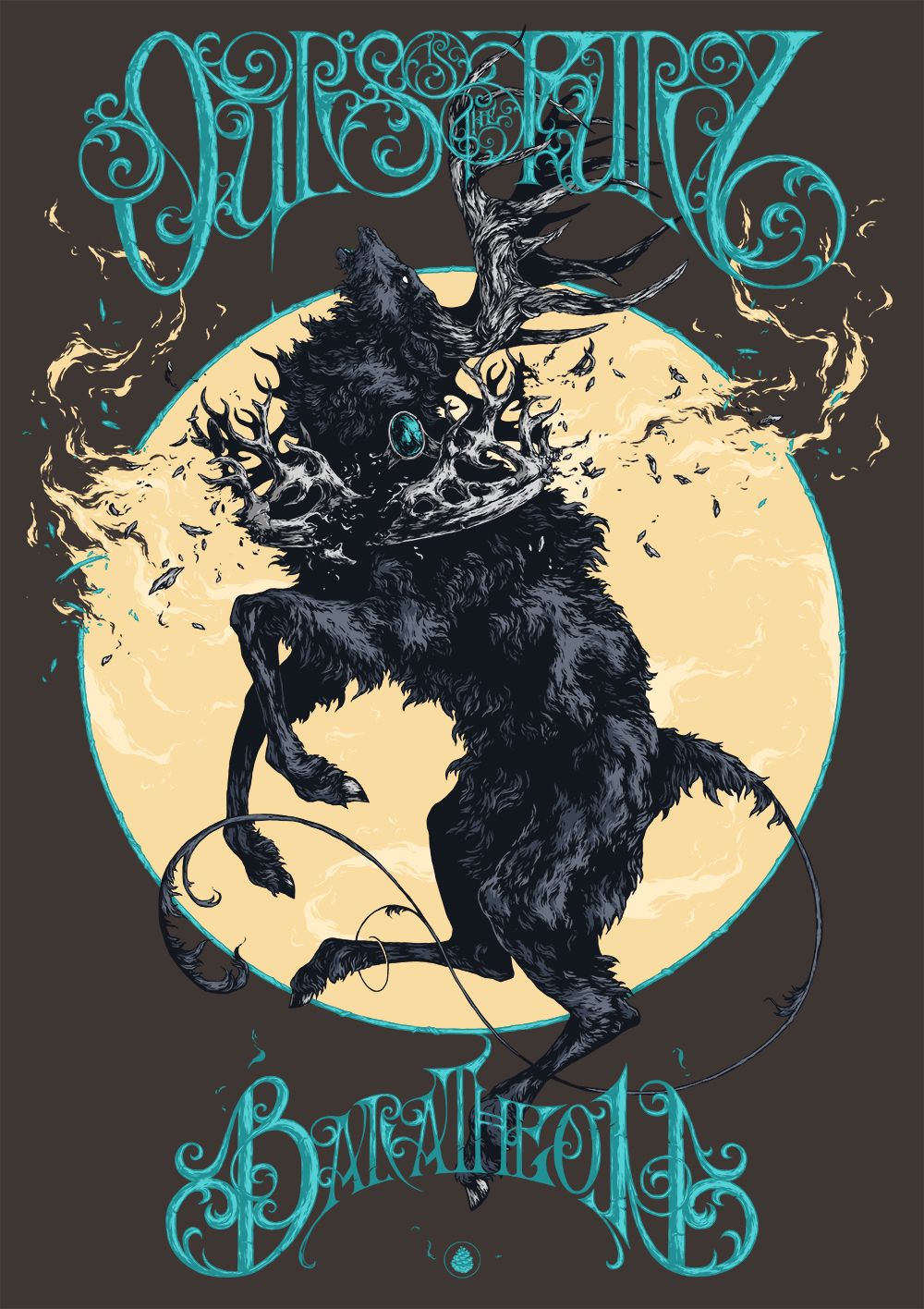
One of Ivan’s most popular projects are the series of illustrations that he did as fan-art for Game of Thrones. Using his own styles of illustration and typography he represented the animals, names and mottos of four of the great houses from the Game of Thrones world. The animals are illustrated with some of the same injuries that members of that house have suffered (the lion is missing a paw). These posters are amazingly detailed works of art and the huge amount of time that must have gone into each one definitely show.
Below: Sketches of illustrative typography for Game of Thrones posters.
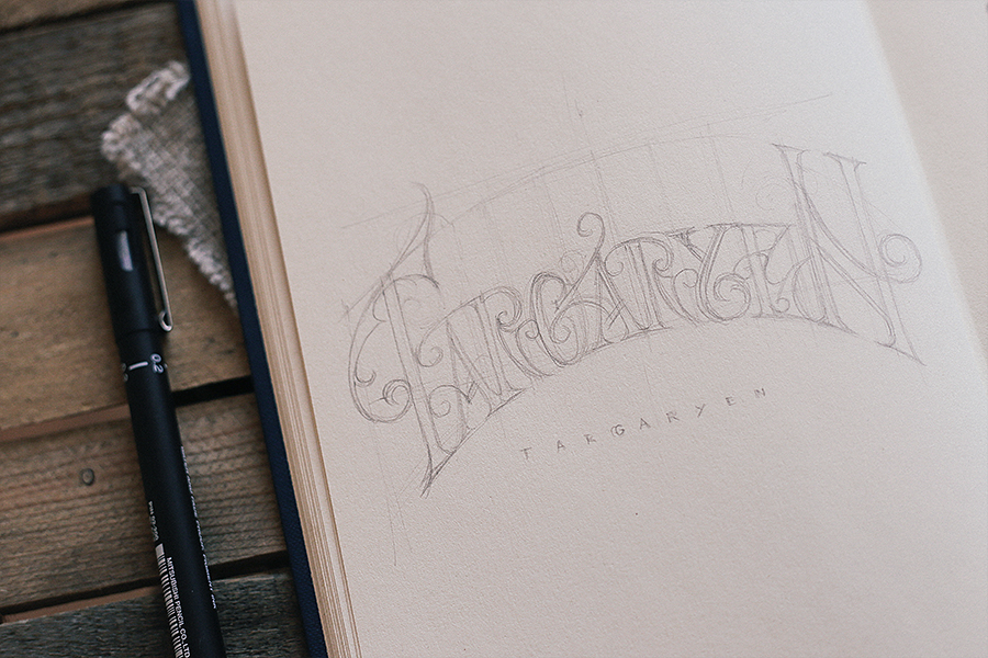
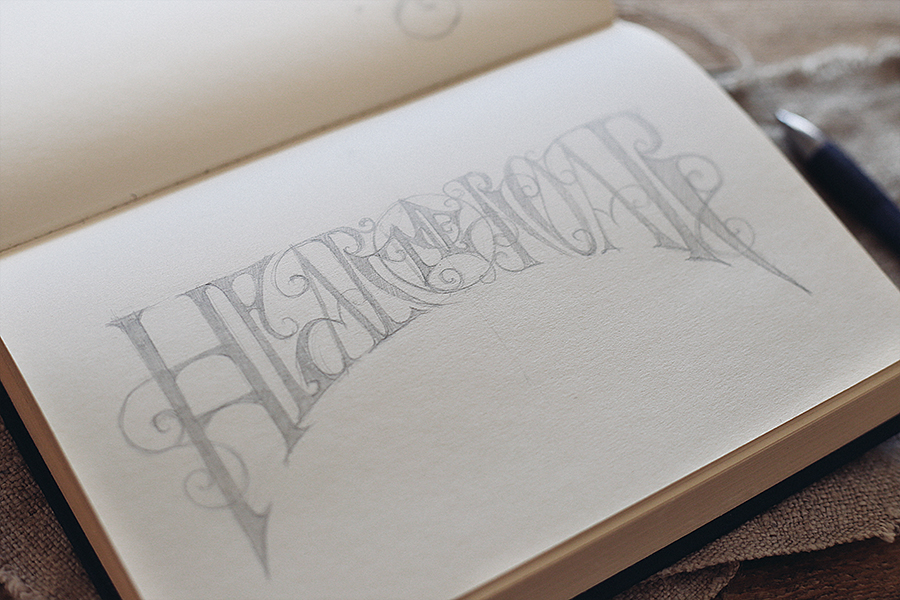
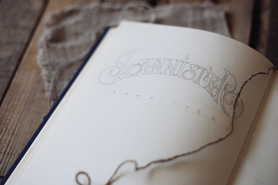
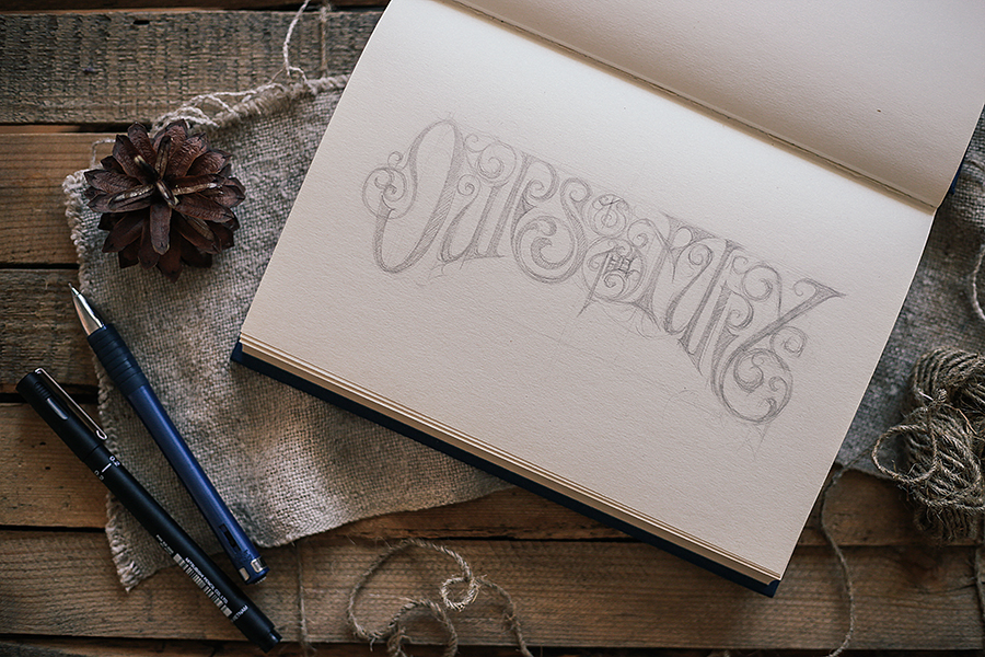
Below: Illustrative posters for four of the Game of Thrones houses, House Stark, House Baratheon, House Lannister and House Targaryen. The typography is the name of each house and its motto.


On another note, I also really like his logo. The simple small pinecone fits naturally into the themes of a lot of his illustrations and it is a subtle little symbol that represents the work he does well without having to resort to using any type. This is particularly impressive as Ivan clearly has no problem creating great illustrative typography, (see the sketches above) and so I think he is showing real restraint by having his logo as a small, relatively simple, image.
If you want to check out Ivan’s work I’ve linked his pages below.
Website – www.ivanbelikov.com
Behance – @so_static
Society6 – @further_up
Instagram – @further_up
Twitter – @further_u
Facebook – furtheru
Save