I Love… Josef Muller-Brockmann
Josef Muller-Brockmann was a Swiss graphic designer, author and teacher who was born on May 9th 1914. He spent much of his life living and working in Zurich and studied a wide variety of topics including design, architecture and history of art. He apprenticed as a graphic designer to Walter Diggleman, a designer and advertising consultant. In 1936, he opened his own studio, which specialised in graphic design, photography and exhibitions.
Josef Muller-Brockmann’s poster designs are known for being the epitome of Swiss (International) style typography, one of my favourite styles of design. Swiss style is defined as seeking “a universal graphic expression through a grid-based design purged of extraneous illustration and subjective feeling”. In practical terms this means using clean sans-serif typography in a strict grid system, combined with simple shapes and bold colours. Josef Muller-Brockmann – along with Armin Hofmann at the Basel School of Design – was one of the first designers to develop and lead the way for this particular way of designing.
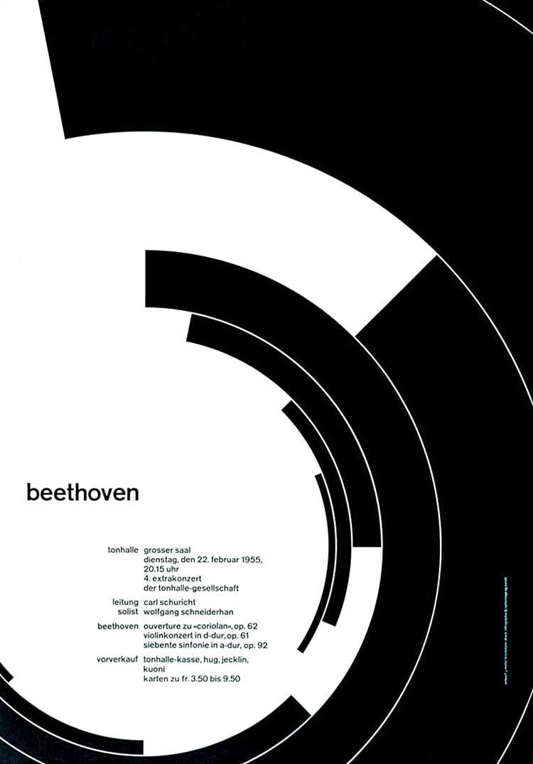 One of Josef Muller-Brockmann’s most well known poster designs is the poster he designed for a Beethoven concert at the Zurich Tonhalle (left). This poster has the simplest possible colour scheme, black ink on white paper. The strong contrast of these colours, along with the concentric sections of the circles, mirrors the drama of Beethoven’s music.
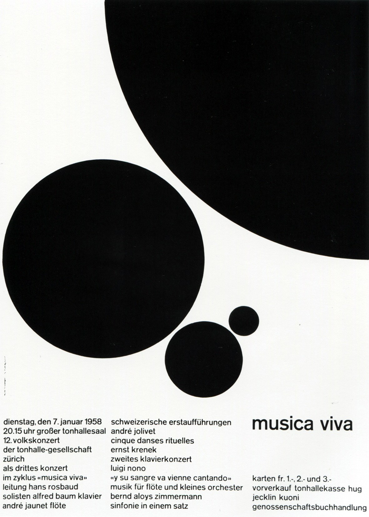 This style can also be seen in his “Musica Viva” poster (right), also for the Zurich Tonhalle. This poster also uses a simple, bold black and white colour scheme and is even less complex than the previous poster, being made of only plain black circles and black sans-serif typography. Despite this severe simplicity, this poster still has an aesthetic attraction. This is possibly due to the mathematic ratios that were used to set out the grid system, as well as the size of, and distance between, the different circles. Josef Muller-Brockmann had a strict set of rules that he stuck to when designing grids, which he set out in his book “Grid Systems in Graphic Design”.
Many designers have said that Josef Muller-Brockmann has had a significant impact on them and on the field of design as a whole. One modern professional designer who was most influenced by Josef Muller-Brockmann is Mike Joyce, the creator of the book Swissted, which  you can read about in this blog post. One of these posters is “The Damned” poster (left), which has clearly been influenced by the “Musica Viva” poster but with a more modern take than the more restrained and older style of Josef Muller-Brockmann, which uses a brightly coloured, angular and larger style of typography. Mike Joyce has named Josef Muller-Brockmann as an inspiration, saying in an AIGA.org article, “(His) work was quite vivid and expressive… each design masterfully evokes the mood, tone, and harmony of the music in which the poster is announcing.”
Josef Muller-Brockmann has had a noticeable impact on graphic design, and on me and my own work. I have been inspired by his work, books and teaching as have many designers and design students since the 1950s. Josef Muller-Brockmann’s poster designs in particular are an inspiration, and you can see their influence in my Exhibition of Typography project. His work influences much of my own typography and reminds me to keep my type simple, functional and easy to read.